Component styles
Component Style controls the appearance of buttons, input fields, tabs, menus and panels. This page describes the seven styles, their adjustment options, and how they work with themes and other appearance settings.
Themes and component styles
Theme sets the light or dark appearance, backgrounds and accent color. Component Style sets the fills, outlines, shadows and selected states of controls. Every style follows the current theme. When Theme is set to Follow System, the style updates with the active light or dark theme.
Component styles are available on Windows, macOS and Linux. Switching styles preserves the interface layout, its controls and your saved custom color schemes.
Changing the component style
- Press Ctrl+Shift+P (macOS: ⌘+,) to open Settings.
- Select Appearance and find Component Style in the Colors group.
- Click the current style name and choose a style from the dropdown.
The selection takes effect immediately in all windows and is retained after restarting. Flat is the default. The description below the setting explains the selected style. Styles with adjustment options also show their sliders below.
The seven styles
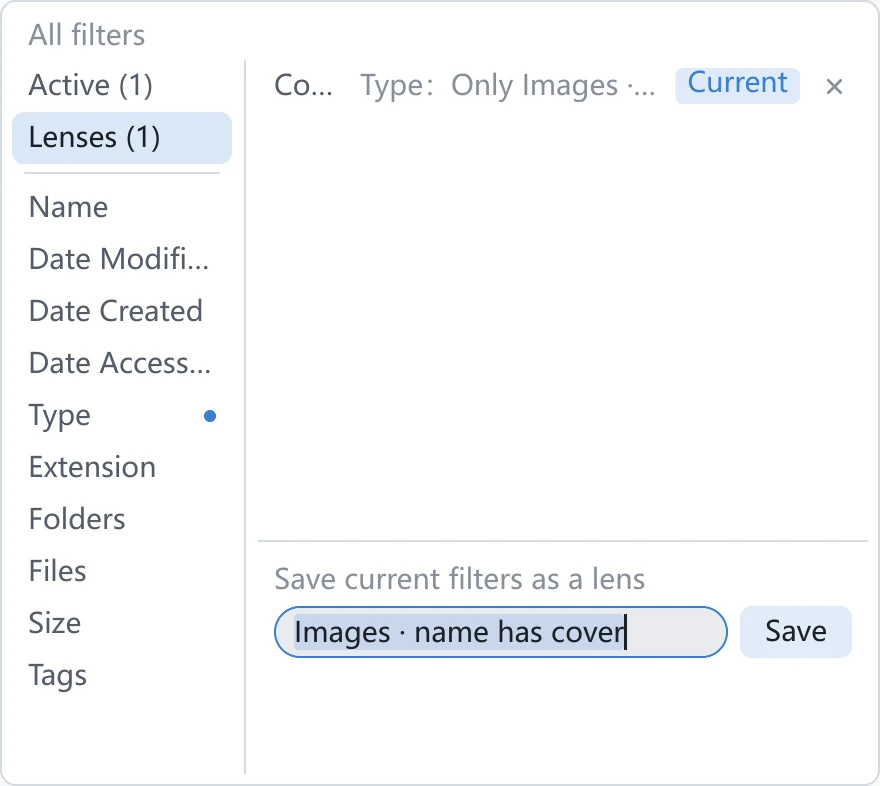
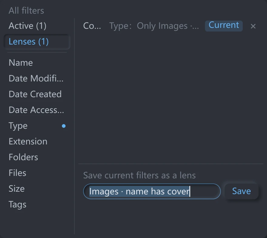
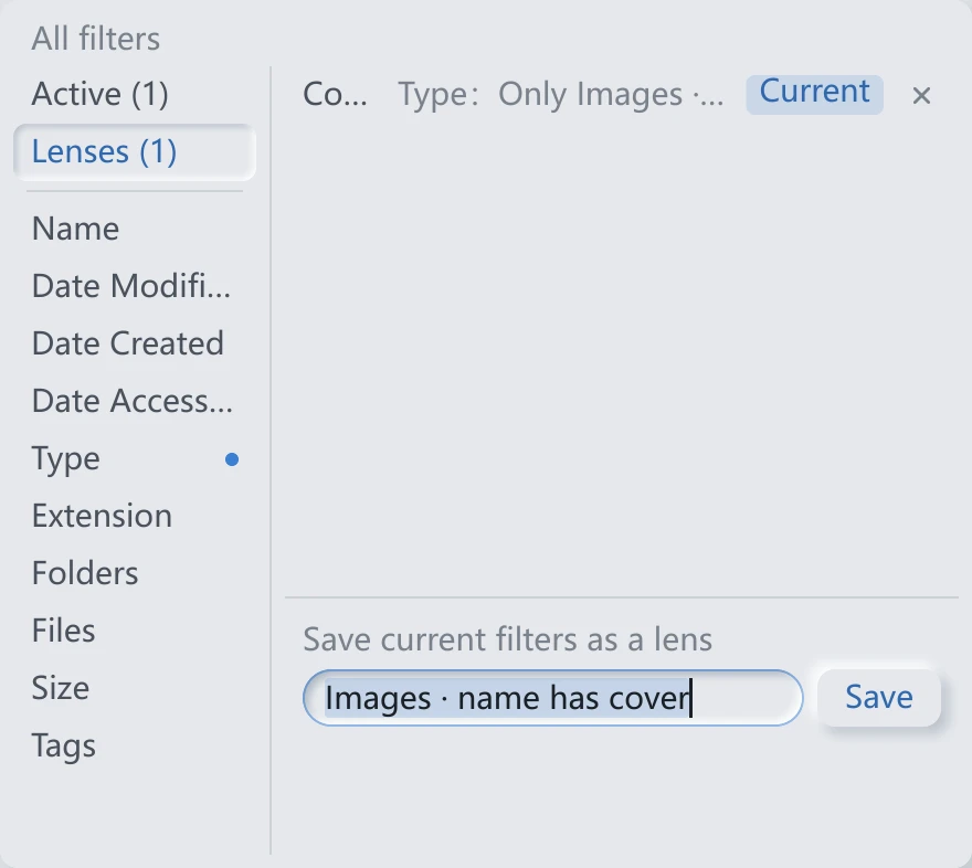
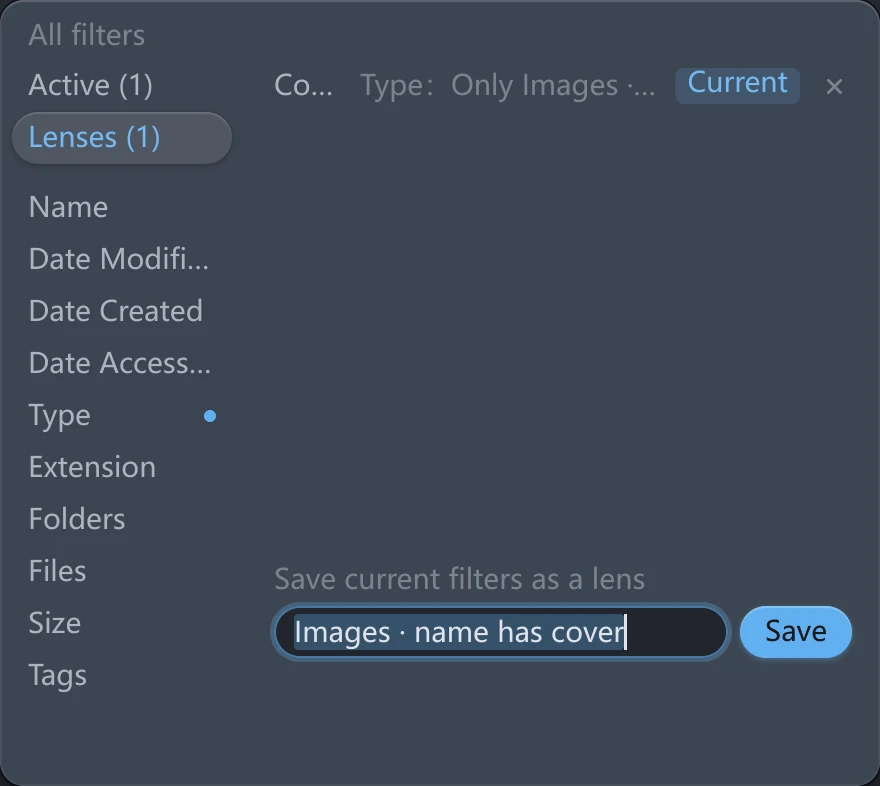
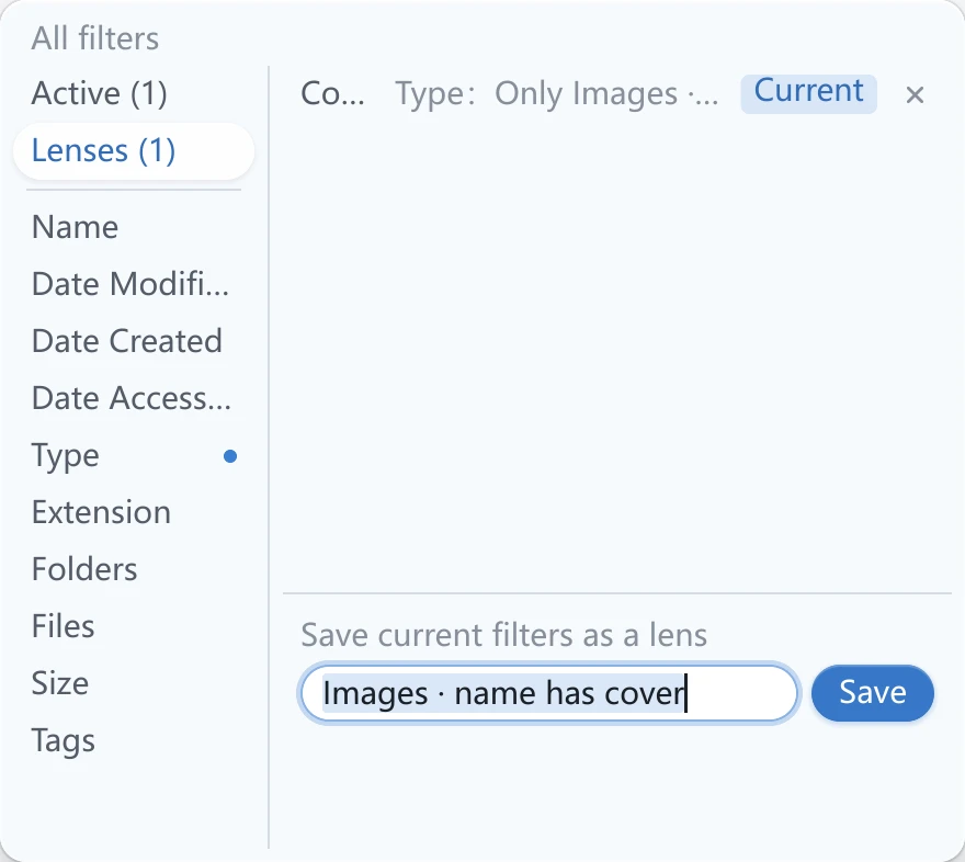
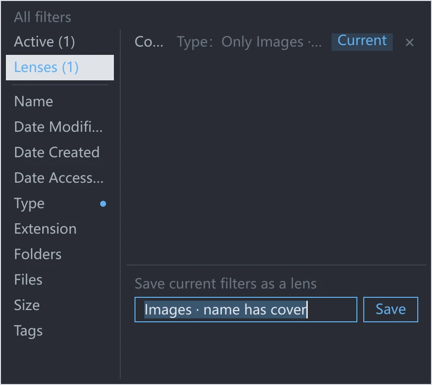
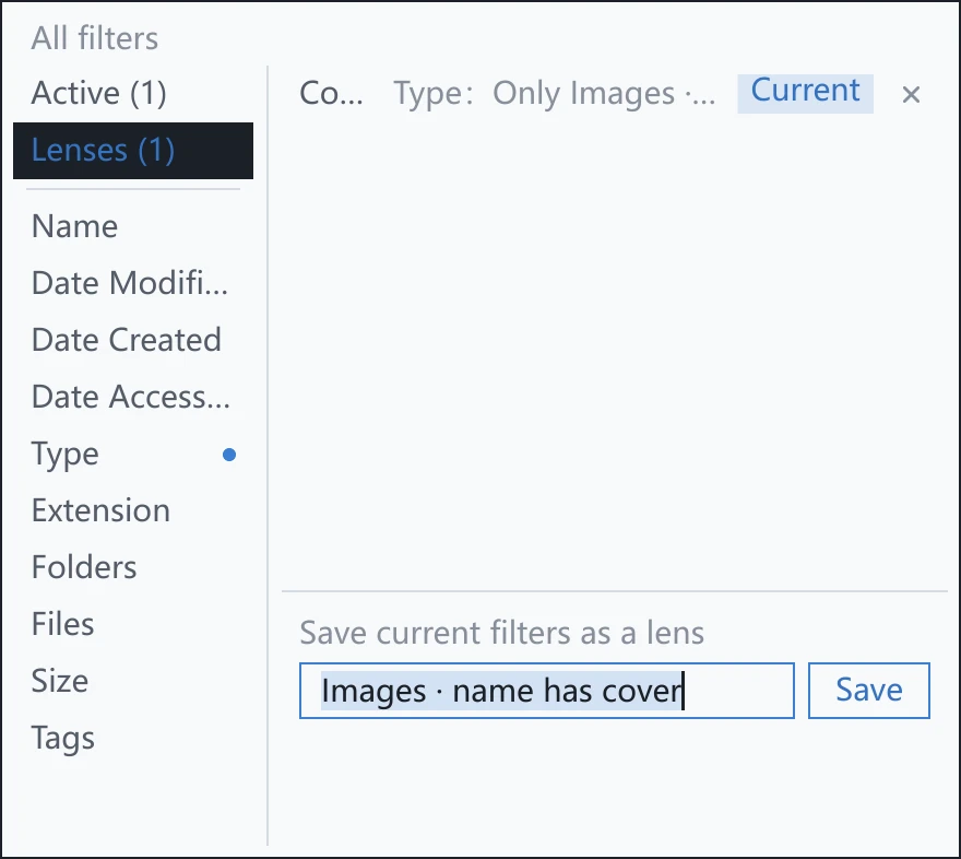
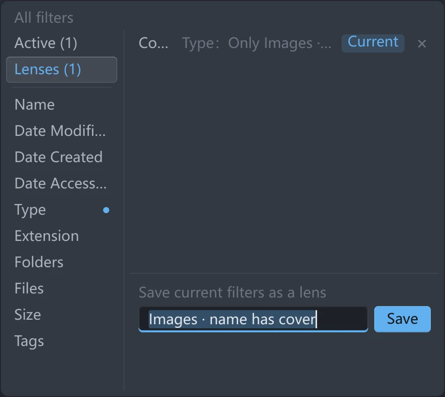
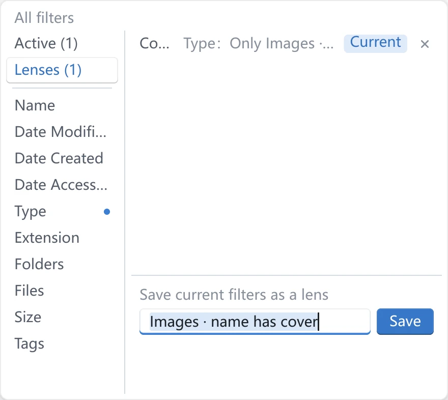
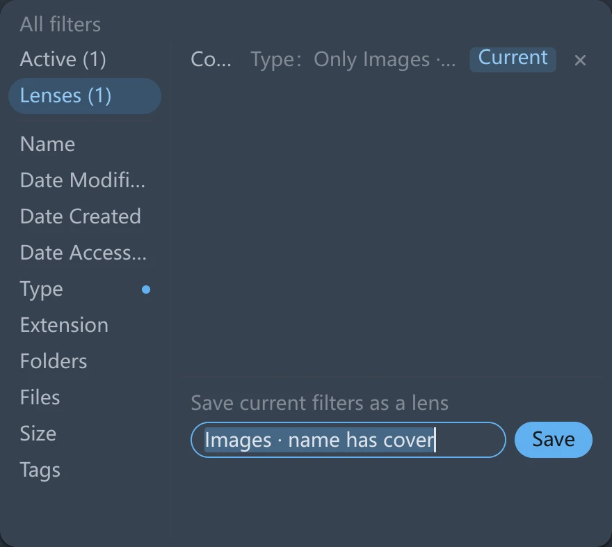
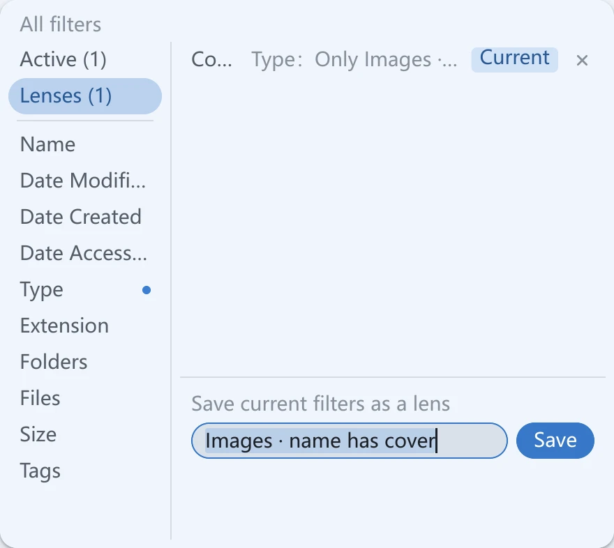
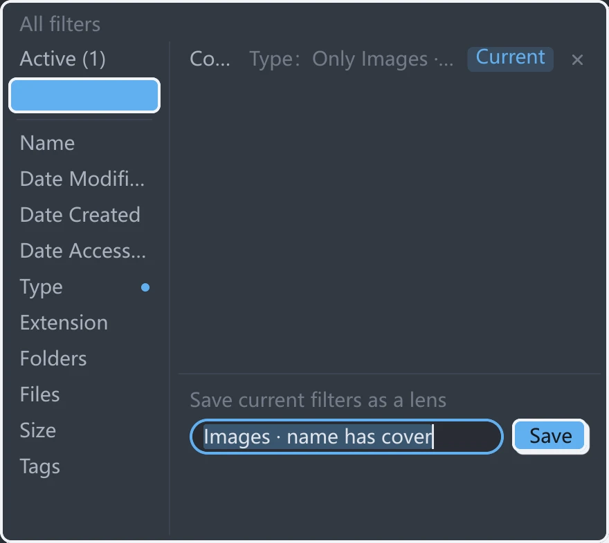
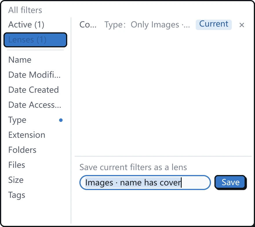
The screenshots below show the same All filters panel, so you can compare fields, buttons, selected items, outlines and shadows.
Flat
Flat uses solid-colored surfaces without relief or shadows on controls. It is the default tessoa style.
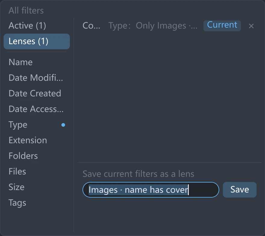
Neumorphic
Neumorphic gives backgrounds, buttons and containers similar surface colors. Buttons and cards appear slightly raised; fields, enabled switches, the current tab and selected segments appear recessed. Buttons also sink when pressed. Rows in the file list, sidebar and menus retain flat highlights.
Neumorphic adjusts the lightness and intensity of theme backgrounds, so the displayed background may differ from the original color in a custom scheme. Brightly colored backgrounds become more subdued. You can adjust this with Tint Strength and Follow Theme Lightness below the style setting.
Glass
Glass adds a frosted appearance, thin highlights and soft shadows to the tab and address bars, sidebar, footer and pop-up menus. The file list, previews and Details panel keep solid backgrounds, as do dialogs and settings cards.
The current tab and selected segments appear as raised light blocks. The frosted appearance does not reveal the desktop or other programs behind the window. See System transparency settings for the effect of system preferences.
Wireframe
Wireframe uses a terminal-style appearance with square corners, thin outlines and one background color. Controls have no shadows. The current tab, selected segments and enabled switches use inverted colors: text color fills the control, and the text and icons take the background color. Rows in the file list, sidebar and menus retain flat highlights.
Wireframe always uses square corners, so Corner Roundness is hidden in this style. The font is still determined by the font settings under Appearance.
Native
Native uses Windows 11–style small rounded corners, thin outlines and subtle fills. Buttons appear slightly raised, and the current tab and enabled controls appear as light blocks. Input fields have a more prominent bottom line when focused.
This style is available on every platform. Windows environments that support Window Material can also use Mica or Acrylic.
Tonal
Tonal uses Material 3–style colors. Backgrounds take a light tint from the accent color. The current tab and enabled controls appear as light tonal pills, while primary action buttons use a solid accent color. Menus have soft shadows, and dialogs have larger rounded corners.
Surface Tint below the style setting controls how much accent color is mixed into backgrounds. At 0%, backgrounds use the theme's original colors. Controls retain their Tonal shapes and selected states.
Brutalist
Brutalist uses thick outlines and hard, unblurred shadows. The current tab, selected segments and enabled controls use solid accent-colored blocks, and the window frame also takes on the accent color. Pressing a button moves its surface toward the shadow, making it appear to sink.
The content area, menus and dialogs keep the theme's original background colors. Rows in the file list, sidebar and menus retain flat highlights. Corner roundness can still be adjusted under Appearance.
Adjustment options
These sliders appear below Component Style only when the corresponding style is selected. Changes take effect immediately in all windows.
| Setting | Style | Default and range | Effect |
|---|---|---|---|
| Tint Strength | Neumorphic | Default 100%, 0%–150% | Sets how much of the theme's hue the background keeps. Lower values move it toward neutral gray. |
| Follow Theme Lightness | Neumorphic | Default 0%, 0%–100% | Sets how closely background lightness follows the original theme. Higher values look more like the theme but reduce the depth of buttons and fields. |
| Surface Tint | Tonal | Default 5%, 0%–15% | Sets how much accent color is mixed into backgrounds. At 0%, they use the theme's original colors. |
These values are shared by all themes and are retained when switching styles or restarting. Reset to Defaults resets all three adjustments along with appearance options such as font and spacing.
Other appearance settings
These settings appear only when the selected style uses them. Switching to another style temporarily hides the corresponding settings but preserves their values. They take effect again when you return to a compatible style.
| Setting | Styles | Effect and conditions |
|---|---|---|
| Window Material / Translucent Content Area | Flat, Wireframe, Native | Shown only in Windows environments that support window materials. Translucent Content Area also requires a material other than None. |
| Tab Outline / Tab Outline Width | Flat, Wireframe, Brutalist | Adjust the opacity and width of outlines on inactive tabs. |
| Corner Roundness | Flat, Neumorphic, Glass, Native, Tonal, Brutalist | Adjusts interface corner roundness. Wireframe always uses square corners. |
Window Material requires Windows 11 22H2 or later and a graphics environment that supports window transparency. This setting is unavailable on macOS and Linux. Neumorphic, Glass, Tonal and Brutalist use their own solid surfaces. Switching to one of these styles temporarily stops using any selected Mica or Acrylic effect.
System transparency settings
Glass follows the system transparency preferences on Windows and macOS.
| Platform | Conditions and effect |
|---|---|
| Windows | Turning off Transparency effects makes Glass use solid surfaces. Window materials also require this option to be enabled. |
| macOS | Turning on System Settings → Accessibility → Display → Reduce transparency makes Glass use solid surfaces. |
| Linux | Glass uses its frosted appearance without reading the desktop environment's transparency preferences. |
After a system transparency setting changes, tessoa updates the appearance the next time you change the theme, modify settings or restart. Glass and window materials use separate appearance effects. Choosing Glass does not enable Mica or Acrylic.
Themes and colors · Window materials · View modes · v0.28.0 release notes